Rogue Physical Therapy | Branding & Identity Design
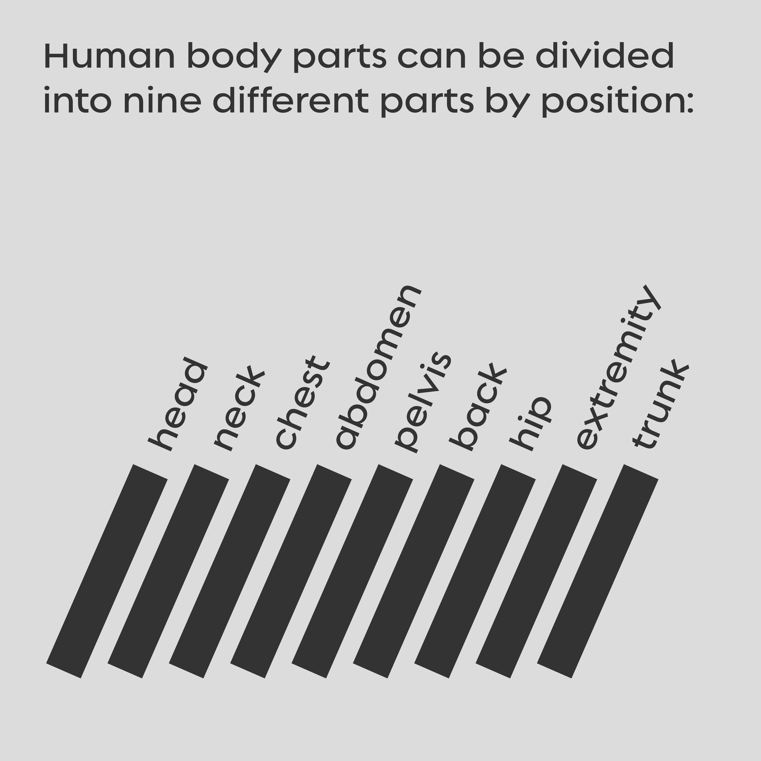
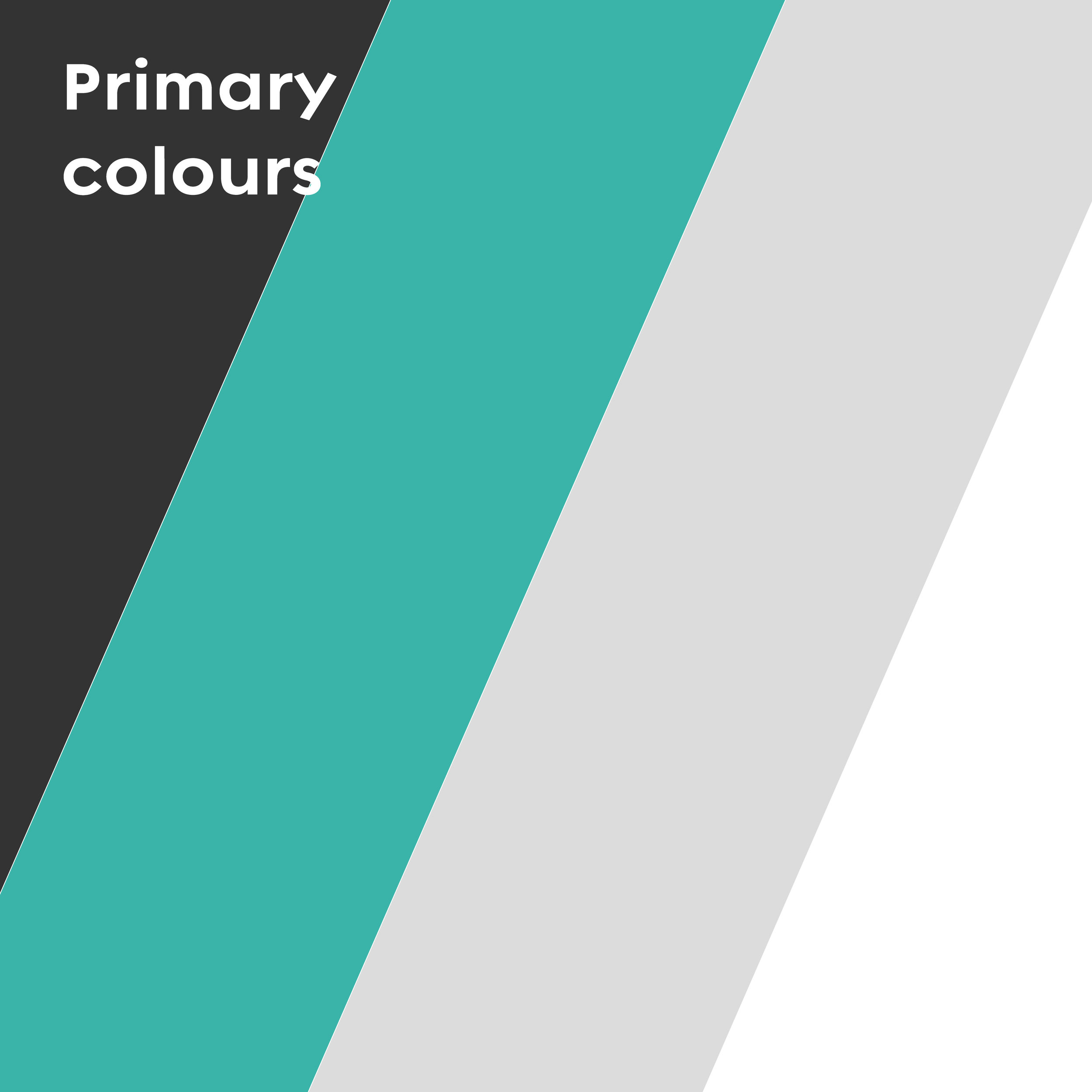
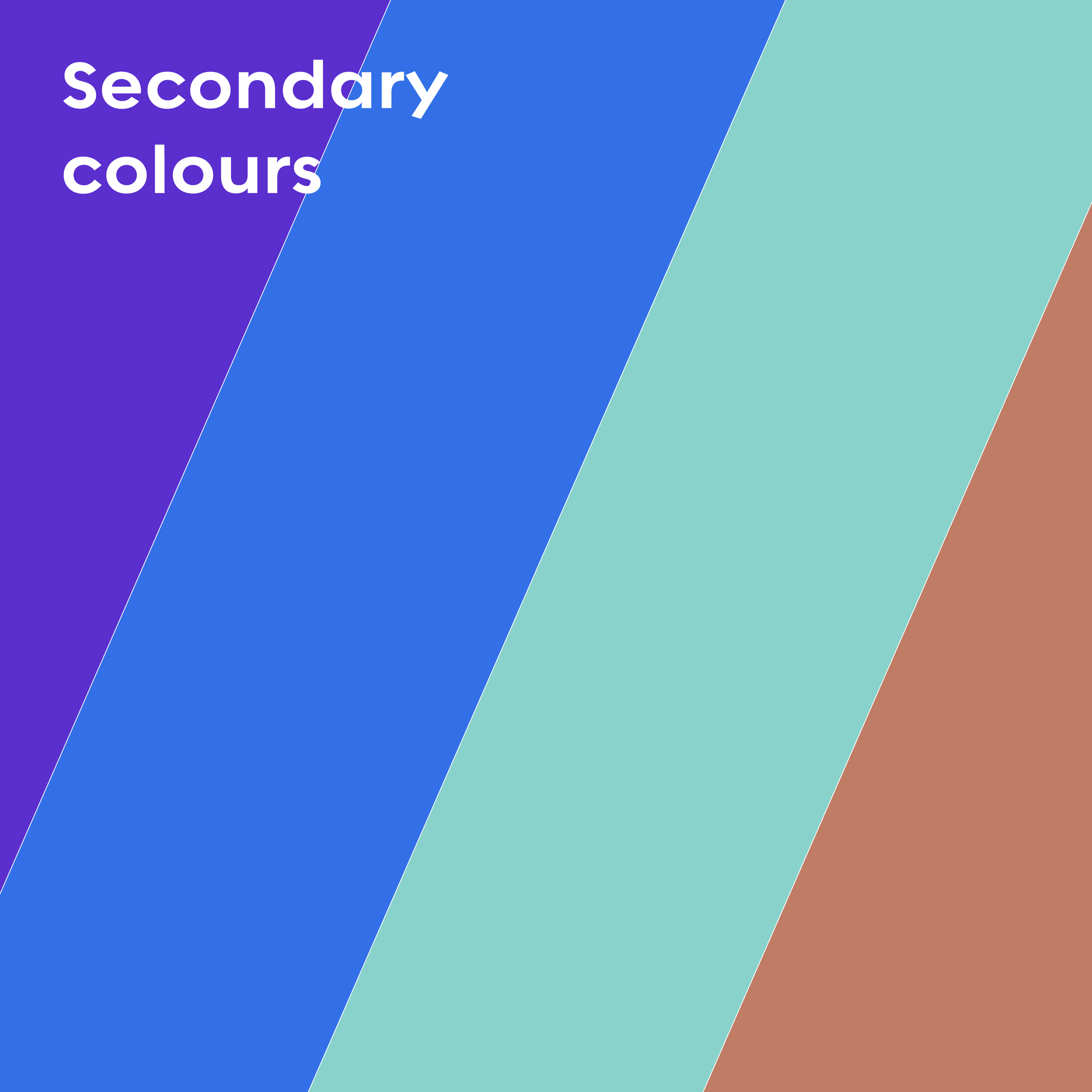
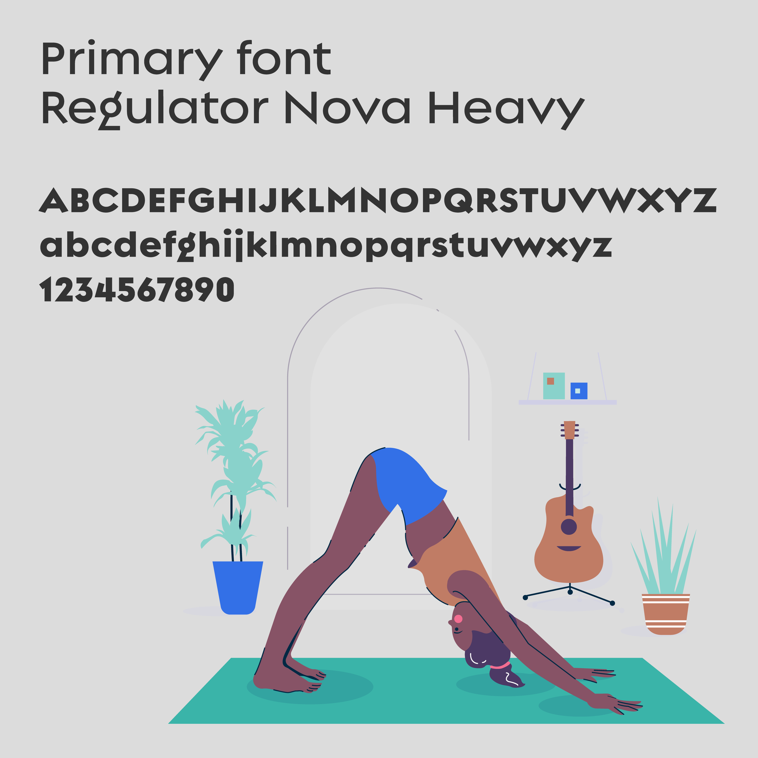
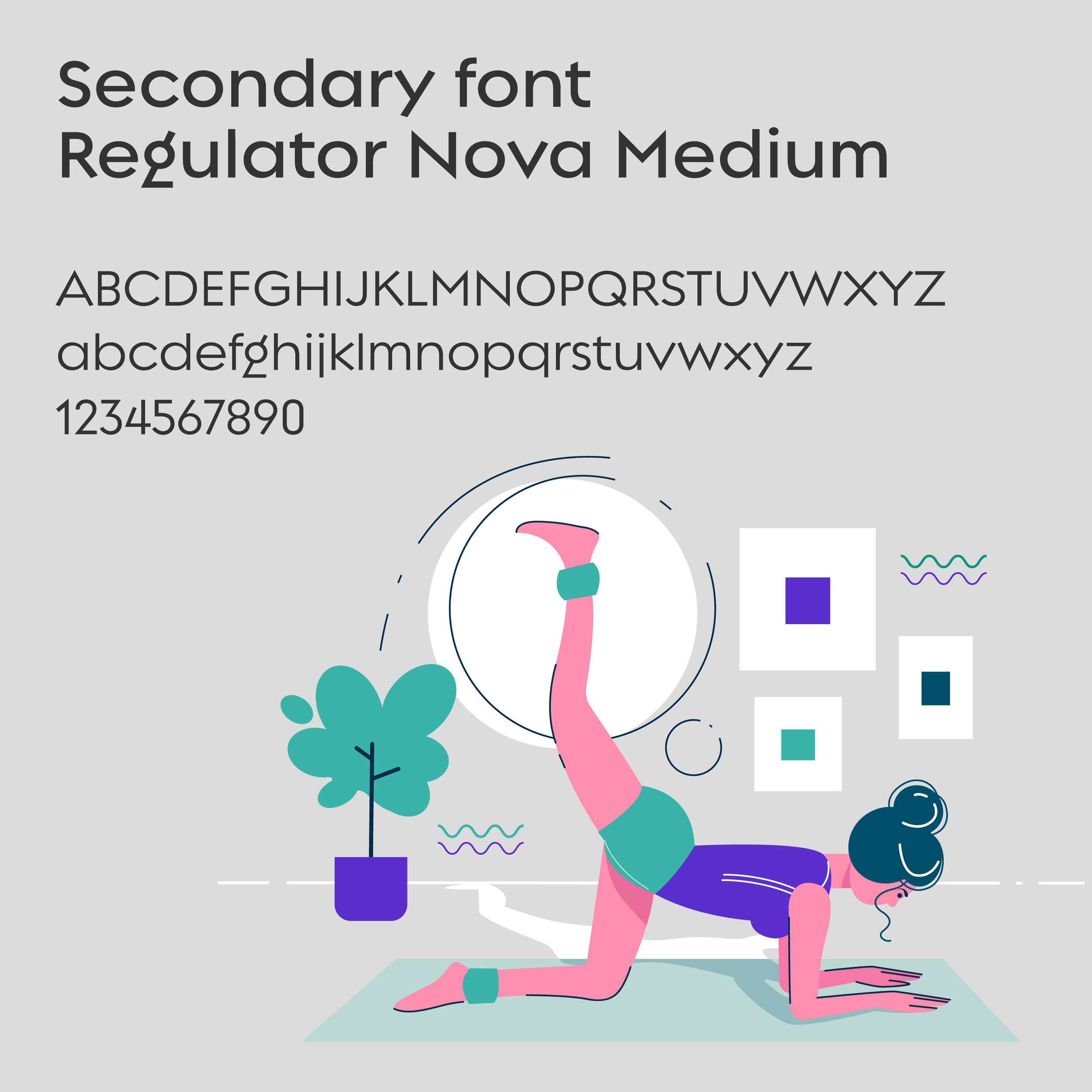
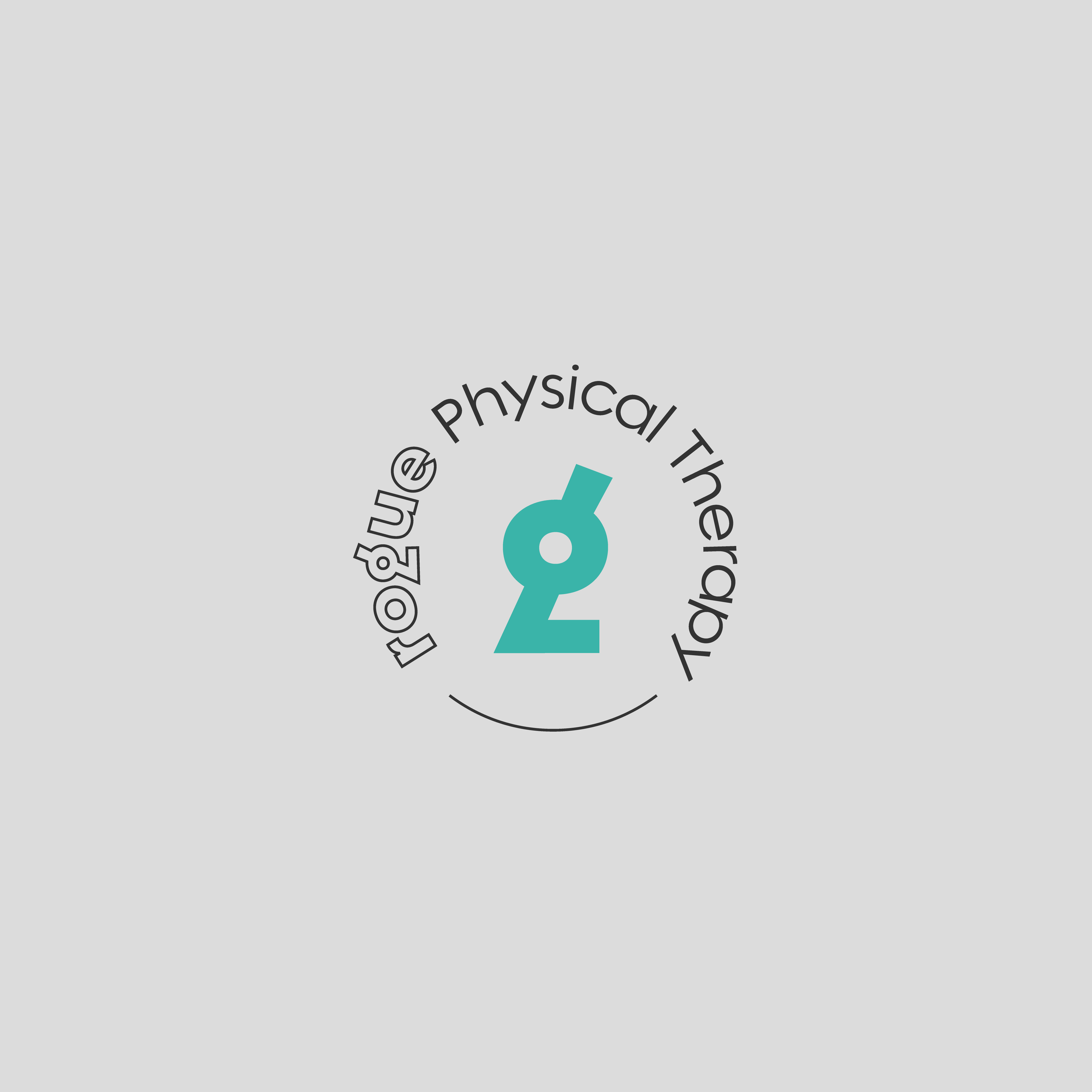
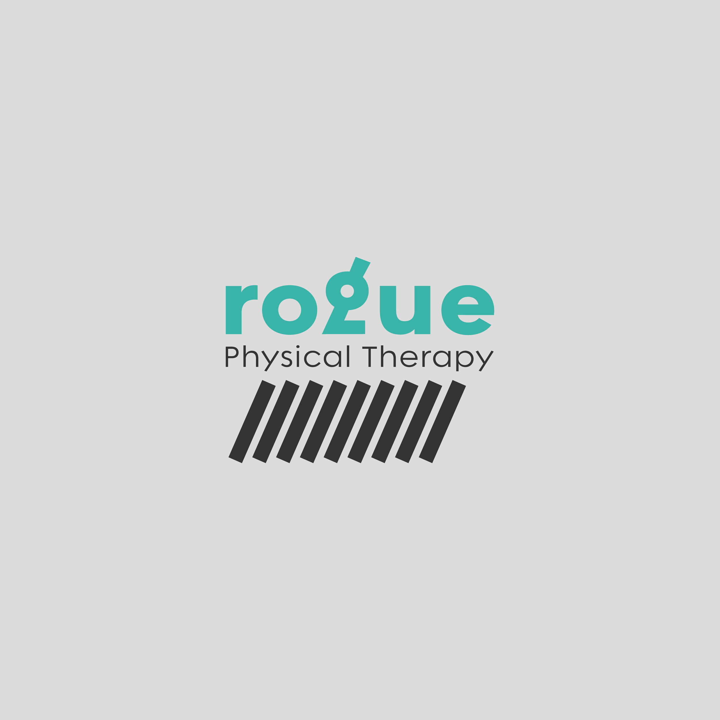
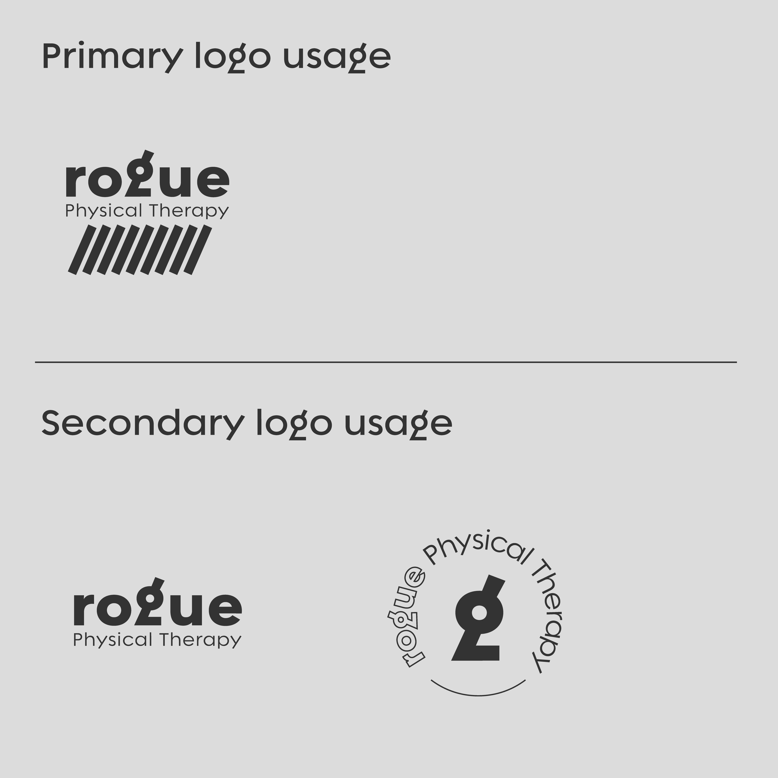
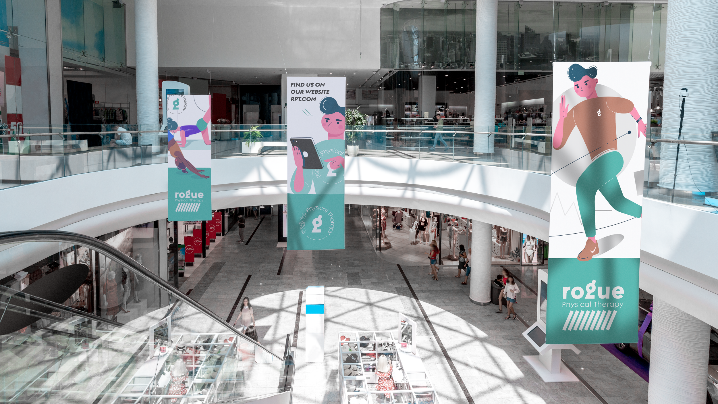
Rogue Physical Therapy needed a brand that balanced professionalism with approachability—conveying expertise in rehabilitation while maintaining a calm, welcoming presence. A pastel color palette was chosen to reflect a sense of ease and healing, moving away from the clinical feel of traditional medical branding. The typography played a key role in reinforcing the brand's identity, with Regulator Nova selected for its distinctive character. Notably, the letter "G" in Rogue subtly resembles a moving limb, symbolizing motion and recovery. To further enhance the concept, nine lines were incorporated beneath the logo, representing the nine anatomical divisions of the human body. The result is a thoughtfully crafted visual identity that embodies movement, restoration, and a modern approach to rehabilitation.

