Family owned Vodka
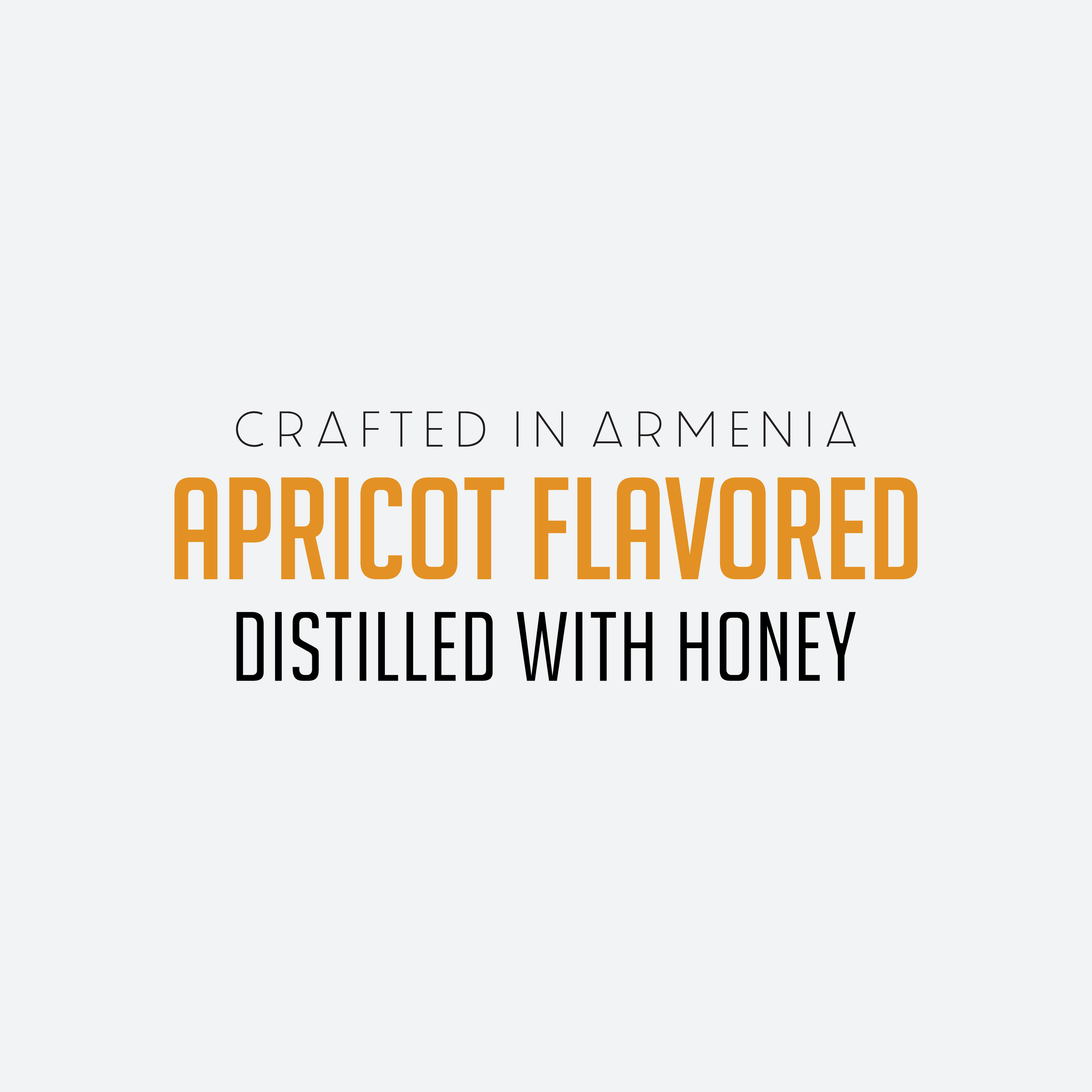
distilled with honey
Branding | Packaging design
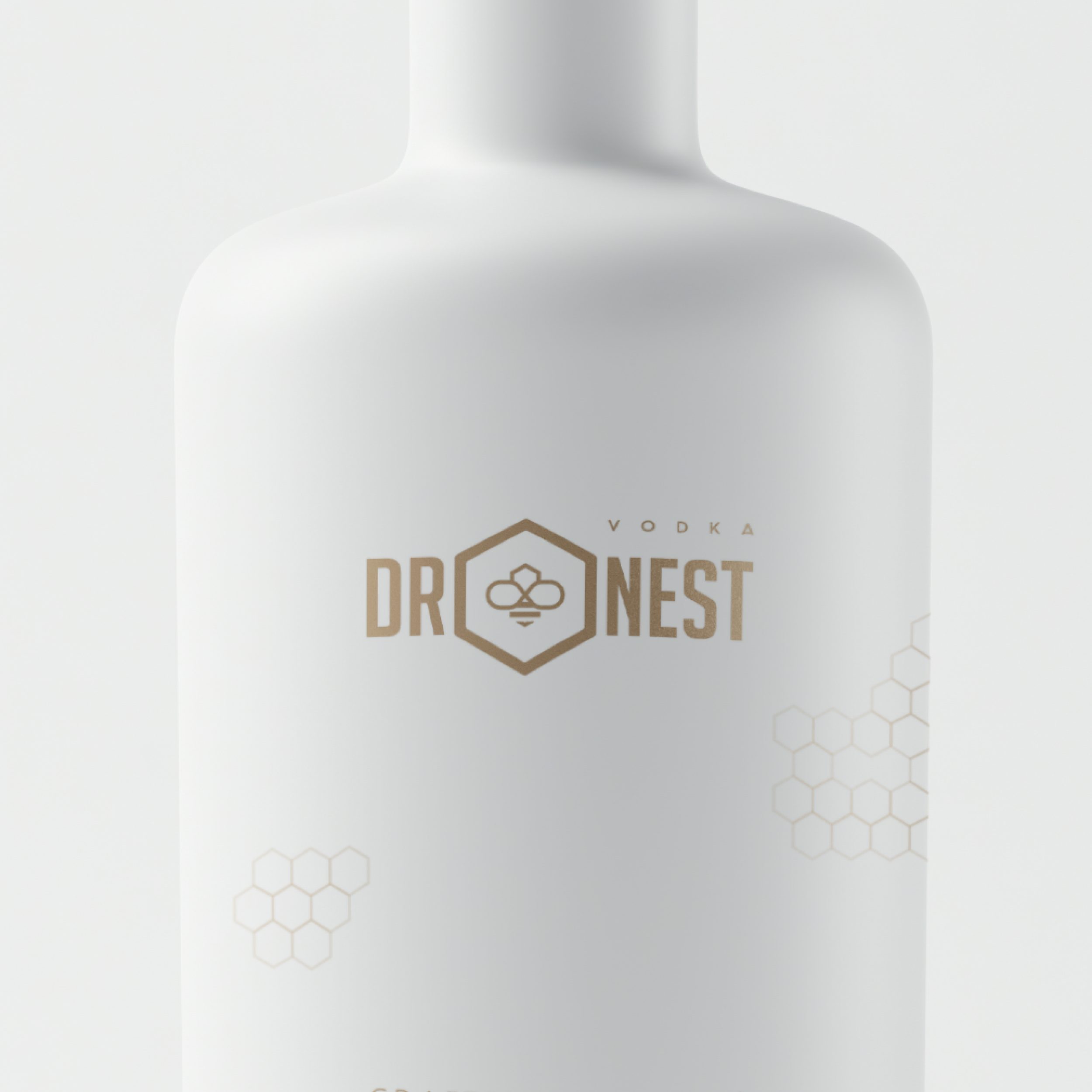
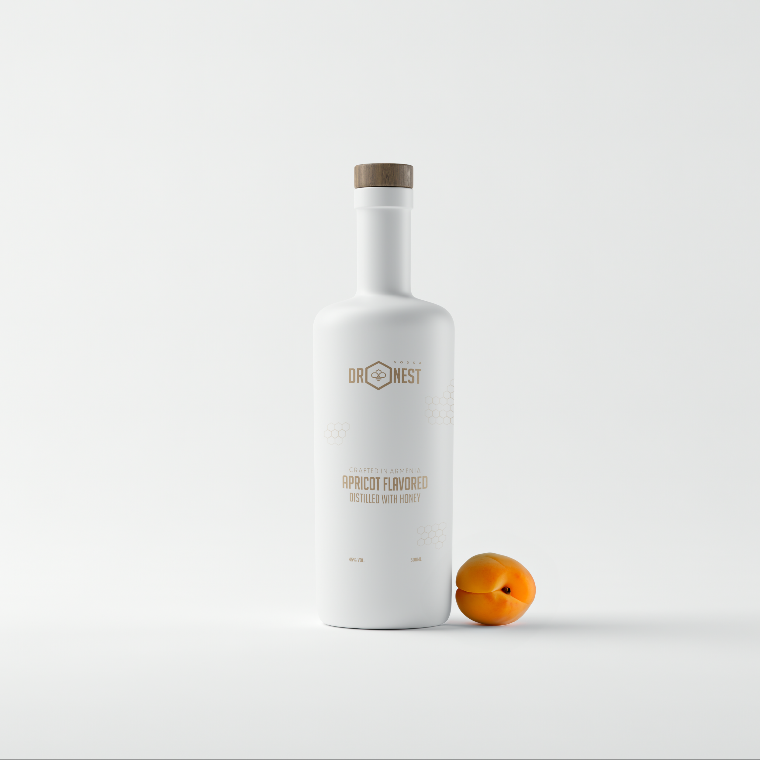
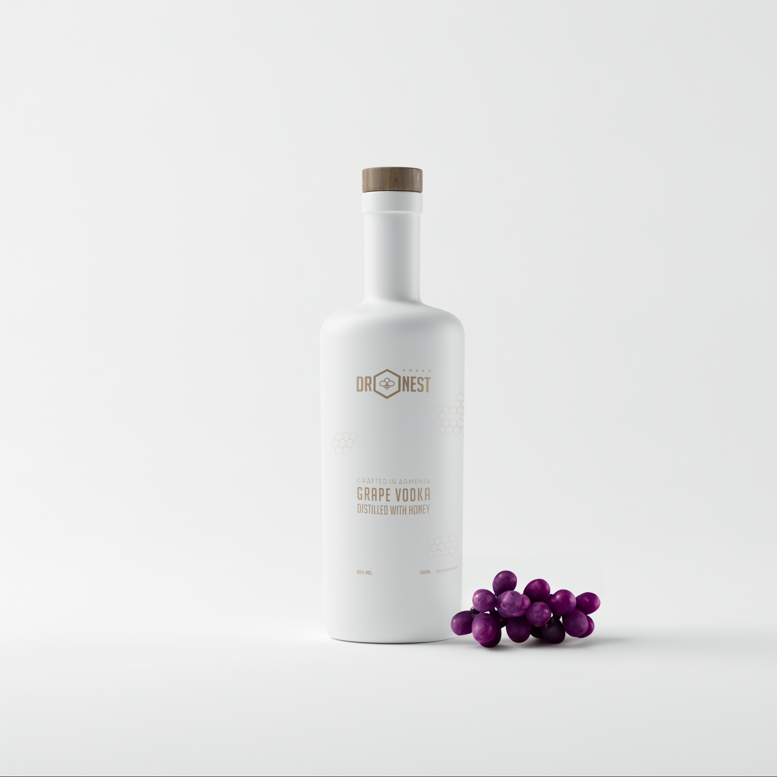
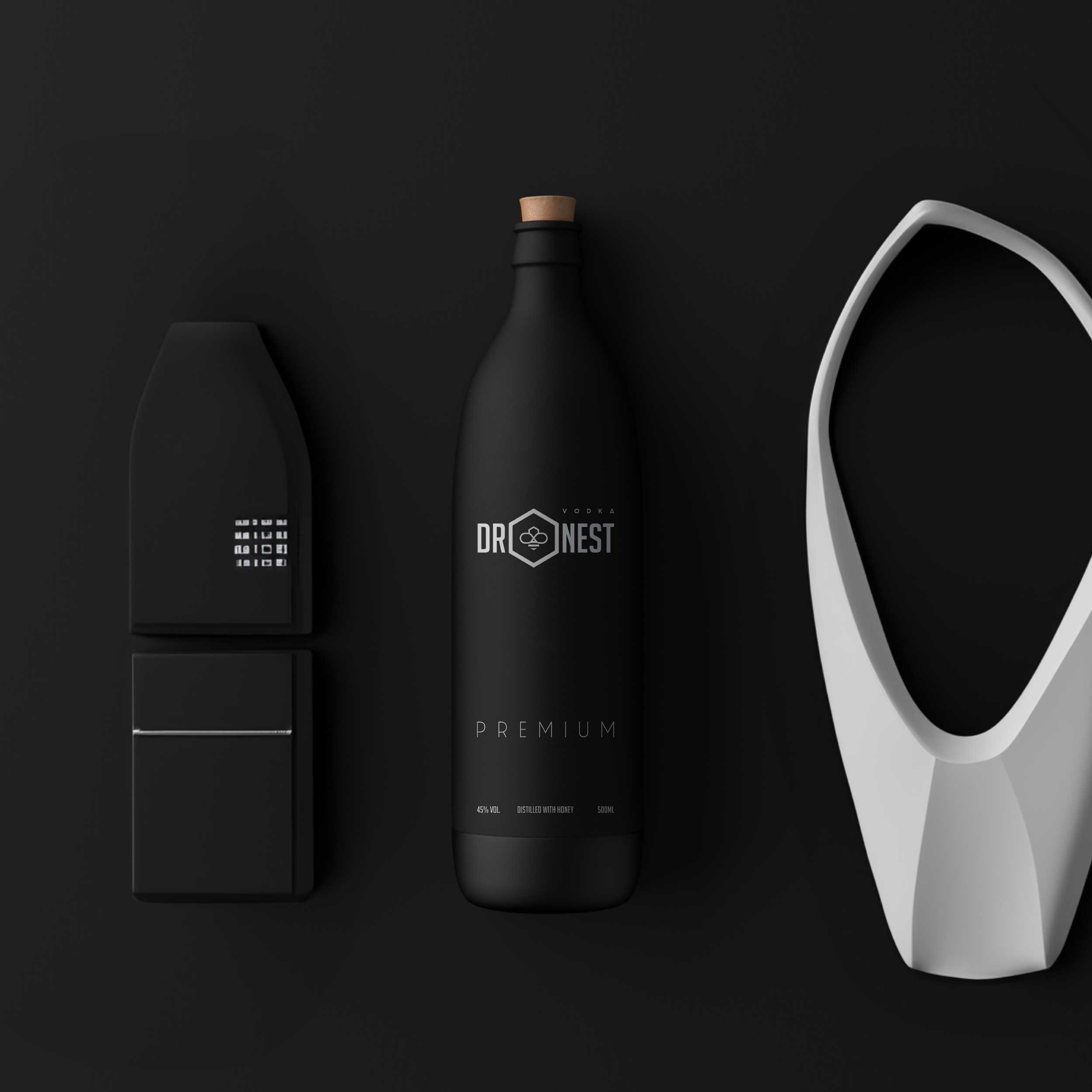
In a market saturated with traditional vodka aesthetics, a father and son duo sought a distinctive visual identity for their honey-infused vodka. The brand, named Dronest—a clever fusion of "drone" (male bees) and "nest" (the home of bees)—needed to communicate both an innovative distillation process and a unique family legacy. The name was coined after hearing their compelling story, capturing the essence of nature’s industrious spirit.
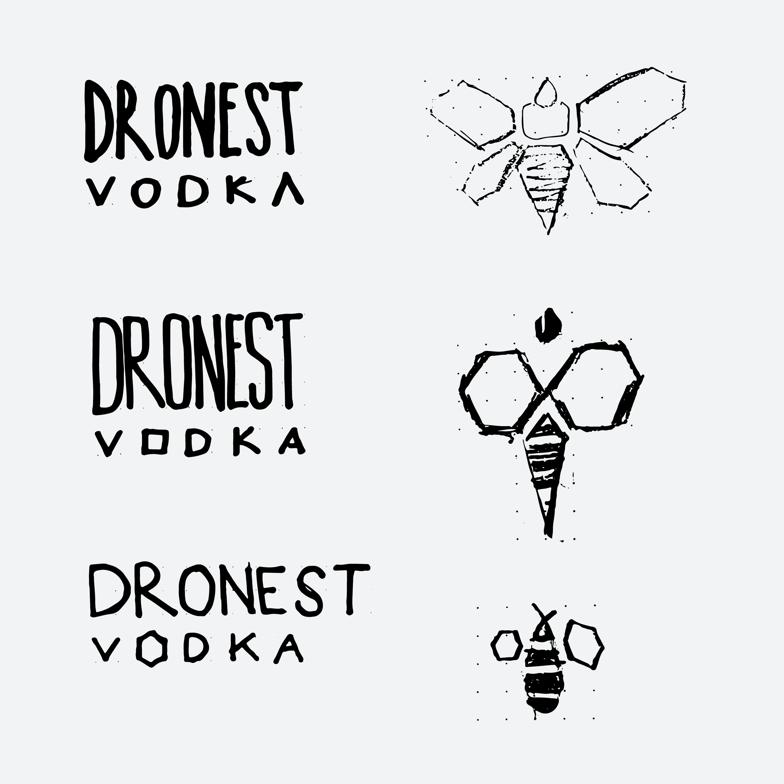
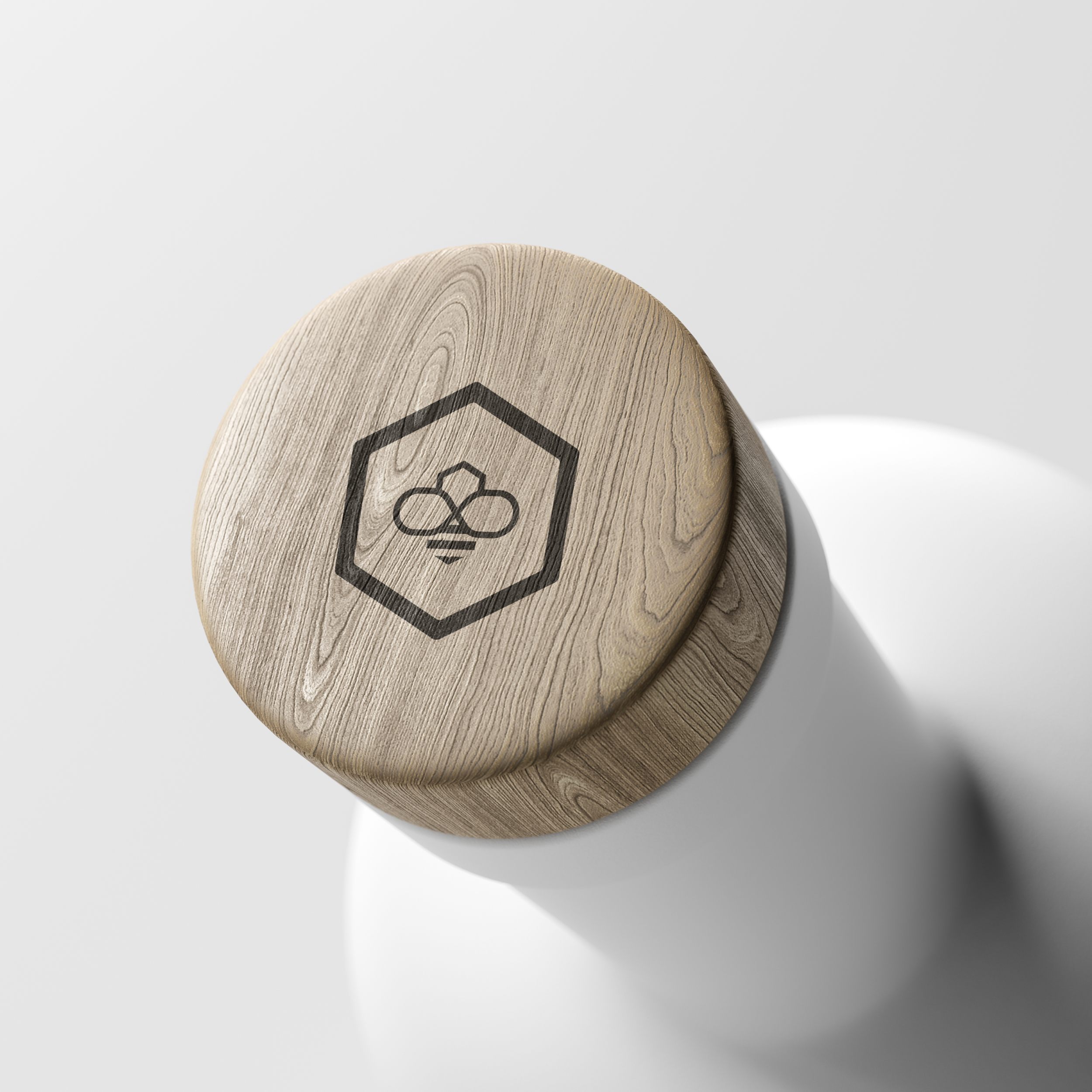
The challenge was to create a design that conveyed these values in a straightforward yet impactful manner. The solution was a minimalistic logo featuring a stylized bee enclosed within a hexagon, a clean representation that embodies the brand’s core concept. The final packaging elevates Dronest in a competitive market, offering a visual narrative of collaboration and creative ingenuity.
